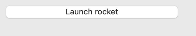
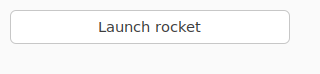
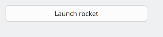
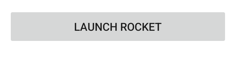
Skip to content

Button

A clickable button.

Button on macOS

Button on Linux (GTK)

Button on Linux (Qt)

Not supported

Button on iOS

Button on Android

Not supported

Screenshot not available

Usage

A button has a text label, or an icon (but not both). If an icon is specified, it will be resized to a size appropriate for the platform. A handler can be associated with button press events.

import toga

def my_callback(button):
    # handle event
    pass

button = toga.Button("Click me", on_press=my_callback)

icon_button = toga.Button(icon=toga.Icon("resources/my_icon"), on_press=my_callback)

Notes

  • A background color of TRANSPARENT will be treated as a reset of the button to the default system color.
  • On macOS, the button text color cannot be set directly; any color style directive will be ignored. The text color is automatically selected by the platform to contrast with the background color of the button.

Reference

Bases: Widget

Source code in core/src/toga/widgets/button.py
 23
 24
 25
 26
 27
 28
 29
 30
 31
 32
 33
 34
 35
 36
 37
 38
 39
 40
 41
 42
 43
 44
 45
 46
 47
 48
 49
 50
 51
 52
 53
 54
 55
 56
 57
 58
 59
 60
 61
 62
 63
 64
 65
 66
 67
 68
 69
 70
 71
 72
 73
 74
 75
 76
 77
 78
 79
 80
 81
 82
 83
 84
 85
 86
 87
 88
 89
 90
 91
 92
 93
 94
 95
 96
 97
 98
 99
100
101
102
103
104
105
106
107
108
109
110
111
112
113
114
115
116
117
118
119
120
121
122
123
124
125
126
127
128
129
130
131
132
133
134
135
136
137
138
139
140
141
142
143
144
145
146
147
class Button(Widget):
    def __init__(
        self,
        text: str | None = None,
        icon: IconContentT | None = None,
        id: str | None = None,
        style: StyleT | None = None,
        on_press: toga.widgets.button.OnPressHandler | None = None,
        enabled: bool = True,
        **kwargs,
    ):
        """Create a new button widget.

        :param text: The text to display on the button.
        :param icon: The icon to display on the button. Can be specified as any valid
            [icon content][toga.icons.IconContentT].
        :param id: The ID for the widget.
        :param style: A style object. If no style is provided, a default style will be
            applied to the widget.
        :param on_press: A handler that will be invoked when the button is pressed.
        :param enabled: Is the button enabled (i.e., can it be pressed?). Optional; by
            default, buttons are created in an enabled state.
        :param kwargs: Initial style properties.
        """
        super().__init__(id, style, **kwargs)

        # Set a dummy handler before installing the actual on_press, because we do not
        # want on_press triggered by the initial value being set
        self.on_press = None

        # Set the content of the button - either an icon, or text, but not both.
        if icon:
            if text is not None:
                raise ValueError("Cannot specify both text and an icon")
            else:
                self.icon = icon
        else:
            self.text = text

        self.on_press = on_press
        self.enabled = enabled

    def _create(self) -> Any:
        return self.factory.Button(interface=self)

    @property
    def text(self) -> str:
        """The text displayed on the button.

        `None`, and the Unicode codepoint U+200B (ZERO WIDTH SPACE), will be
        interpreted and returned as an empty string. Any other object will be converted
        to a string using `str()`.

        Only one line of text can be displayed. Any content after the first newline will
        be ignored.

        If the button is currently displaying an icon, and text is assigned, the icon
        will be replaced by the new text.

        If the button is currently displaying an icon, the empty string will be
        returned.
        """
        return self._impl.get_text()

    @text.setter
    def text(self, value: str | None) -> None:
        # \u200B: zero-width space
        if value is None or value == "\u200b":
            value = ""
        else:
            # Button text can't include line breaks. Strip any content
            # after a line break (if provided)
            value = str(value).split("\n")[0]

        # Set the icon first, so it is clear to implementations such as
        # GTK4 that the text is explicitly set as nothing, instead of an
        # artifact of clearing the icon.
        self._impl.set_icon(None)
        self._impl.set_text(value)
        self.refresh()

    @property
    def icon(self) -> toga.Icon | None:
        """The icon displayed on the button.

        Can be specified as any valid [icon content][toga.icons.IconContentT].

        If the button is currently displaying text, and an icon is assigned, the text
        will be replaced by the new icon.

        If `None` is assigned as an icon, the button will become a text button with an
        empty label.

        Returns `None` if the button is currently displaying text.
        """
        return self._impl.get_icon()

    @icon.setter
    def icon(self, value: IconContentT | None) -> None:
        if isinstance(value, toga.Icon):
            icon = value
            text = ""
        elif value is None:
            if self.icon is None:
                # Already a null icon; nothing changes.
                return
            else:
                icon = None
                text = self._impl.get_text()
        else:
            icon = toga.Icon(value)
            text = ""

        self._impl.set_icon(icon)
        self._impl.set_text(text)
        self.refresh()

    @property
    def on_press(self) -> OnPressHandler:
        """The handler to invoke when the button is pressed."""
        return self._on_press

    @on_press.setter
    def on_press(self, handler: toga.widgets.button.OnPressHandler) -> None:
        self._on_press = wrapped_handler(self, handler)

icon property writable

The icon displayed on the button.

Can be specified as any valid icon content.

If the button is currently displaying text, and an icon is assigned, the text will be replaced by the new icon.

If None is assigned as an icon, the button will become a text button with an empty label.

Returns None if the button is currently displaying text.

on_press property writable

The handler to invoke when the button is pressed.

text property writable

The text displayed on the button.

None, and the Unicode codepoint U+200B (ZERO WIDTH SPACE), will be interpreted and returned as an empty string. Any other object will be converted to a string using str().

Only one line of text can be displayed. Any content after the first newline will be ignored.

If the button is currently displaying an icon, and text is assigned, the icon will be replaced by the new text.

If the button is currently displaying an icon, the empty string will be returned.

__init__(text=None, icon=None, id=None, style=None, on_press=None, enabled=True, **kwargs)

Create a new button widget.

:param text: The text to display on the button. :param icon: The icon to display on the button. Can be specified as any valid icon content. :param id: The ID for the widget. :param style: A style object. If no style is provided, a default style will be applied to the widget. :param on_press: A handler that will be invoked when the button is pressed. :param enabled: Is the button enabled (i.e., can it be pressed?). Optional; by default, buttons are created in an enabled state. :param kwargs: Initial style properties.

Source code in core/src/toga/widgets/button.py
24
25
26
27
28
29
30
31
32
33
34
35
36
37
38
39
40
41
42
43
44
45
46
47
48
49
50
51
52
53
54
55
56
57
58
59
60
61
62
63
def __init__(
    self,
    text: str | None = None,
    icon: IconContentT | None = None,
    id: str | None = None,
    style: StyleT | None = None,
    on_press: toga.widgets.button.OnPressHandler | None = None,
    enabled: bool = True,
    **kwargs,
):
    """Create a new button widget.

    :param text: The text to display on the button.
    :param icon: The icon to display on the button. Can be specified as any valid
        [icon content][toga.icons.IconContentT].
    :param id: The ID for the widget.
    :param style: A style object. If no style is provided, a default style will be
        applied to the widget.
    :param on_press: A handler that will be invoked when the button is pressed.
    :param enabled: Is the button enabled (i.e., can it be pressed?). Optional; by
        default, buttons are created in an enabled state.
    :param kwargs: Initial style properties.
    """
    super().__init__(id, style, **kwargs)

    # Set a dummy handler before installing the actual on_press, because we do not
    # want on_press triggered by the initial value being set
    self.on_press = None

    # Set the content of the button - either an icon, or text, but not both.
    if icon:
        if text is not None:
            raise ValueError("Cannot specify both text and an icon")
        else:
            self.icon = icon
    else:
        self.text = text

    self.on_press = on_press
    self.enabled = enabled

Bases: Protocol

Source code in core/src/toga/widgets/button.py
14
15
16
17
18
19
20
class OnPressHandler(Protocol):
    def __call__(self, widget: Button, **kwargs: Any) -> None:
        """A handler that will be invoked when a button is pressed.

        :param widget: The button that was pressed.
        :param kwargs: Ensures compatibility with arguments added in future versions.
        """

__call__(widget, **kwargs)

A handler that will be invoked when a button is pressed.

:param widget: The button that was pressed. :param kwargs: Ensures compatibility with arguments added in future versions.

Source code in core/src/toga/widgets/button.py
15
16
17
18
19
20
def __call__(self, widget: Button, **kwargs: Any) -> None:
    """A handler that will be invoked when a button is pressed.

    :param widget: The button that was pressed.
    :param kwargs: Ensures compatibility with arguments added in future versions.
    """